Ownership of Newspapers
The company that owns the Daily Mail is DMGT (Daily Mail and General Trust). The company also owns other newspapers such as the Mail on Sunday and Metro. The owner of this company is Jonathan Harmsworth, a viscount; his great-grandfather, Harold Sidney Harmsworth, set up the Daily Mail along with his brother in the late 19th Century and was made the first Viscount Rothermere in 1919.
The Guardian is owned by the Guardian Media Group, a mass media company owning various media operations including The Observer. C.P. Scott (died in 1932) founded the Guardian in 1907 which is owned by the Scott Trust.
News UK is owned by News Corp in Manhattan, New York founded and owned by Rupert Murdoch who owns The Sun, The Sunday Times and The Mail on Sunday.
Questions:
How many organisations own national newspapers and do any companies own more than one title?
The companies that own newspapers consist of:
News UK, which owns the Sun, the Sunday Times and the Mail on Sunday;
The Guardian Media Group which owns the Guardian; Daily Mail and General Trust which owns the Daily Mail, the Mail on Sunday and the Metro.
Which companies own regional newspaper titles?
Newsquest owns 19 daily newspapers and 150 weekly newspapers and the Trinity Mirror owns a lot of other newspapers in England. Companies like these they are able to influence their reader's mindset through their content as it can be from a certain perspective without readers knowing it. If these companies can control multiple newspapers around the country, their opinions can be spread to a more wider target audience which can influence their readers so that those readers will go away with the influenced mindset of the regional companies opinions.
How does this link to Hesmondhalgh's ideas on Cultural Industries?
This links to Hesmondhalgh's ideas on cultural industries as the companies produce similar content within different newspapers as few people own these companies so create a narrowed perspective of content across the media to ensure less risk for readers. These industries rely on repetition and big hits to cover other stories that they think are worthy of media exposure but can be a risk so are repeated until they become a big hit or failure in which they are either exaggerated across multiple newspapers owned by the same company or removed.
Why do you think ownership is something to be concerned about in the UK? Use Curran and Seaton's Power and Media Industries to explore this idea in your post.
I would agree that ownership is something to be concerned about in the UK due to Curran ans Seaton's ideas which suggest that the same companies are in charge of multiple UK newspapers. The idea that the same people control a wide range of newspapers in the media means that they could effectively brainwash readers all over the country through hidden ideas and perspectives, essentially controlling the public through newspaper viewpoints and ideologies with the same material constantly.
Broadsheet and former broadsheet newspapers
|
| The Daily Telegraph | Daily | Broadsheet | 1855 | The Barclay brothers' Press Holdings | Centre-right, conservative | Conservative Party |
| The Sunday Telegraph | Sunday | Broadsheet | 1961 | The Barclay brothers' Press Holdings | Centre-right, conservative | Conservative Party |
| The Times | Daily | Compact since November 2004 | 1785 | News Corporation - Chairman and CEO Rupert Murdoch | Centre-right, conservative | Conservative Party |
| The Sunday Times | Sunday | Broadsheet | 1822 | News Corporation - Chairman and CEO Rupert Murdoch | Centre-right, conservative | Conservative Party |
| The Guardian | Daily | Berliner since 12 September 2005 | 1821 | Scott Trust Limited | Centre-left | Labour Party |
| The Observer | Sunday | Berliner since 8 January 2006 | 1791 | Scott Trust Limited | Centre-left | None |
| Financial Times | Daily | Broadsheet | 1888 | Nikkei Inc. - Japanese media company | Economically liberal | Conservative Party |
| i | Daily | Compact | 2010 | Johnston Press | Centrist (aimed primarily towards younger readers and commuters) | None |
Tabloid newspapers
|
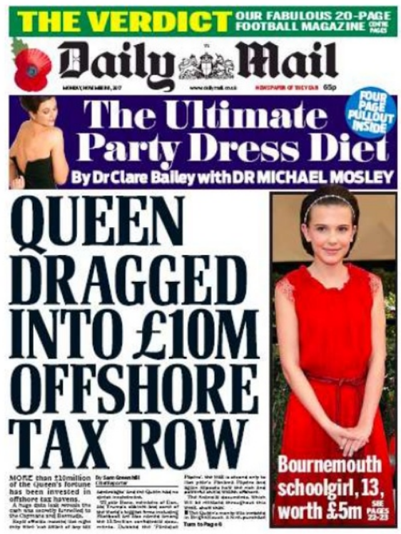
| Daily Mail | Daily | Tabloid (Broadsheet until 1971) | 1896 | Lord Rothermere's Daily Mail and General Trust plc | Right-wing, conservative, populist | Conservative Party |
| The Mail on Sunday | Sunday | Tabloid | 1982 | Lord Rothermere's Daily Mail and General Trust plc | Right-wing, conservative, populist | Conservative Party |
| Daily Express | Daily | Tabloid (Broadsheet until 1977) | 1900 | Richard Desmond's Northern & Shell | Right-wing, Eurosceptic | Conservative Party |
| Sunday Express | Sunday | Tabloid (Broadsheet until 1992) | 1918 | Richard Desmond's Northern & Shell | Right-wing, Eurosceptic | Conservative Party |
| The Sun | Daily | Tabloid | 1964 | News Corporation - Chairman and CEO Rupert Murdoch | Right-wing, conservative, populist | Conservative Party |
| The Sun on Sunday | Sunday | Tabloid | 2012 | News Corporation - Chairman and CEO Rupert Murdoch | Right-wing, conservative, populist | Conservative Party |
| Daily Mirror | Daily | Tabloid | 1903 | Trinity Mirror | Centre-left, populist | Labour Party |
| Sunday Mirror | Sunday | Tabloid | 1915 | Trinity Mirror | Centre-left, populist | Labour Party |
| Sunday People | Sunday | Tabloid | 1881 | Trinity Mirror | Centre-left, populist | None |
| Daily Star | Daily | Tabloid | 1978 | Richard Desmond's Northern & Shell | Largely non-political | None |
| Daily Star Sunday | Sunday | Tabloid | 2002 | Richard Desmond's Northern & Shell | Largely non-political | None |
| Morning Star | Daily | Tabloid | 1930 | People's Press Printing Society - an independent readers' co-operative | Left-wing, socialist | Labour Party |